
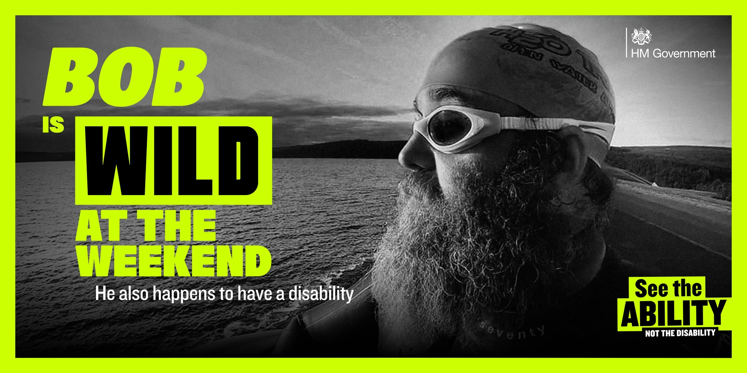
See the ability
The pitch-winning campaign aimed to shift perception, focusing not on disability, but on ability. The visual identity was rooted in the concept of visibility, using a fluorescent colour palette set against black for striking impact. Bold, characterful typefaces were chosen to reflect the individuality and personality of the people featured.


